Sennheiser
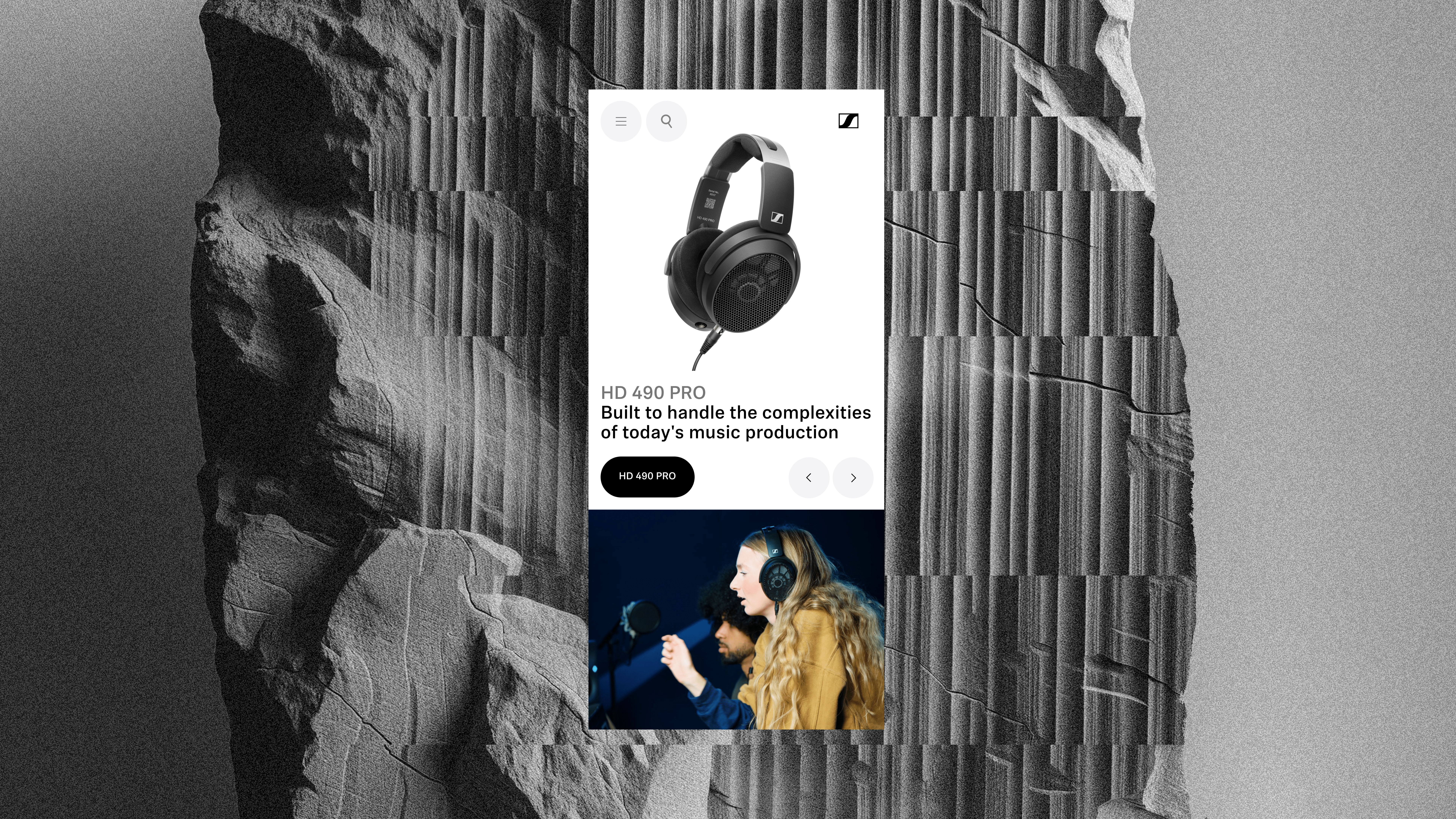
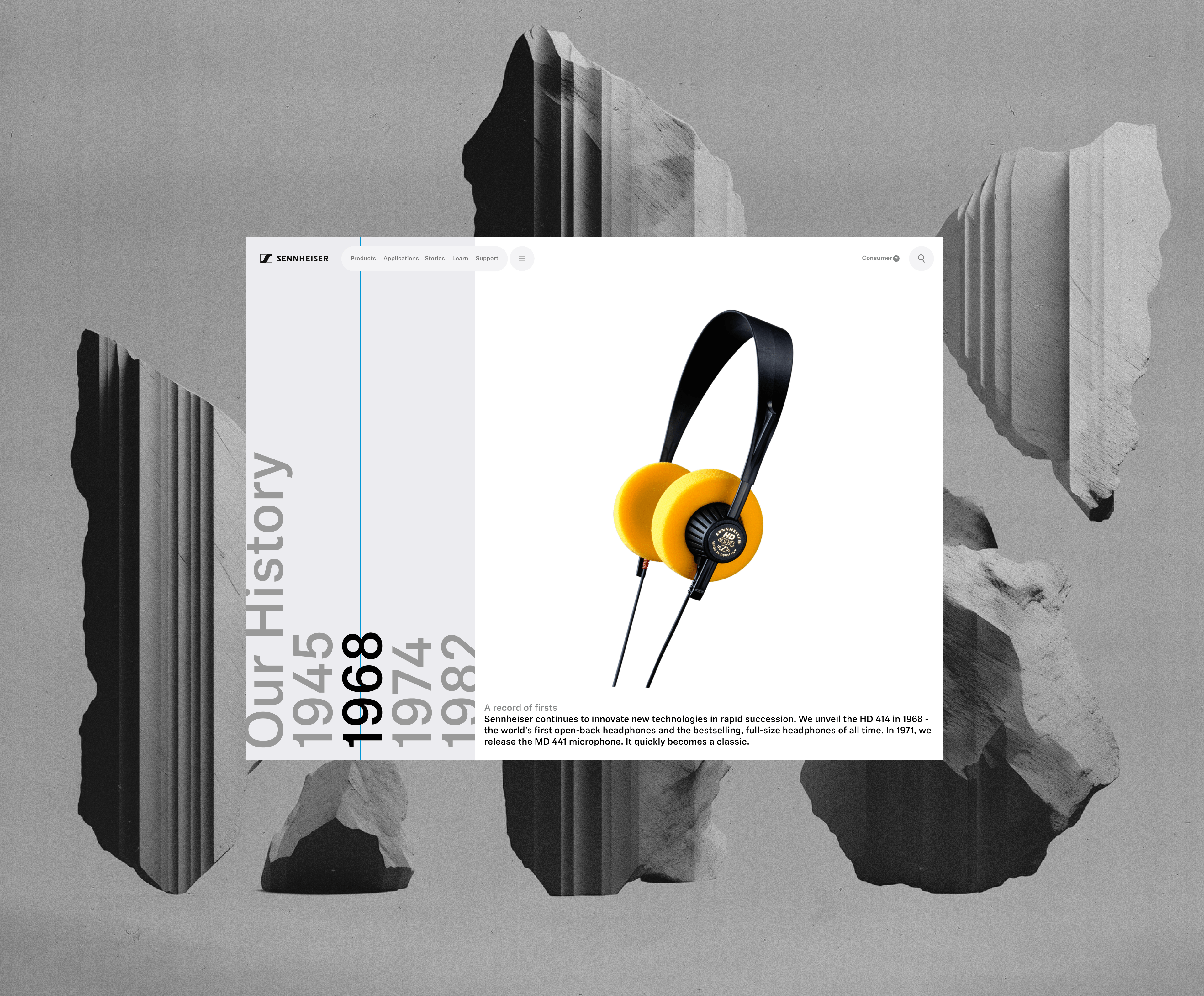
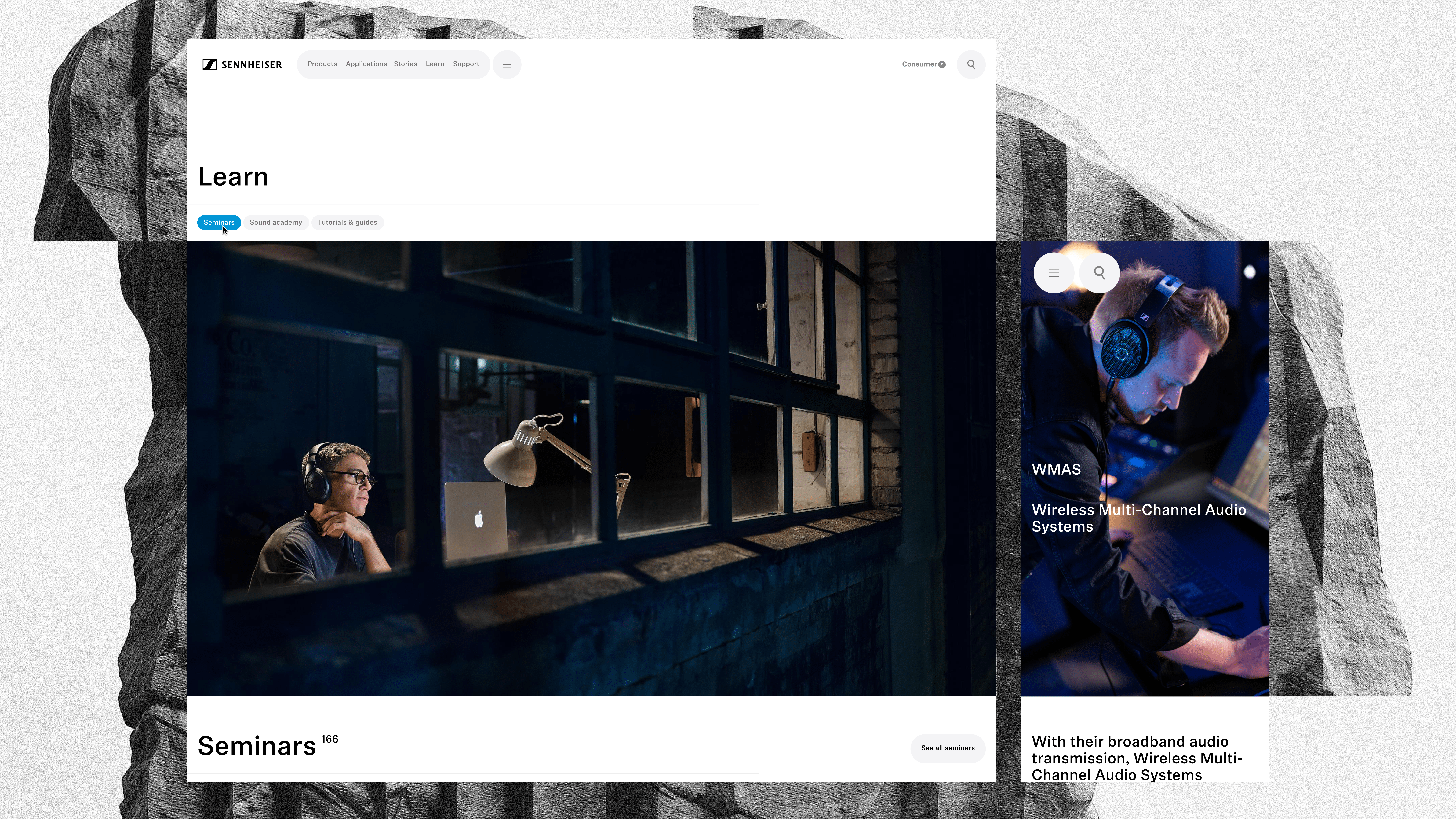
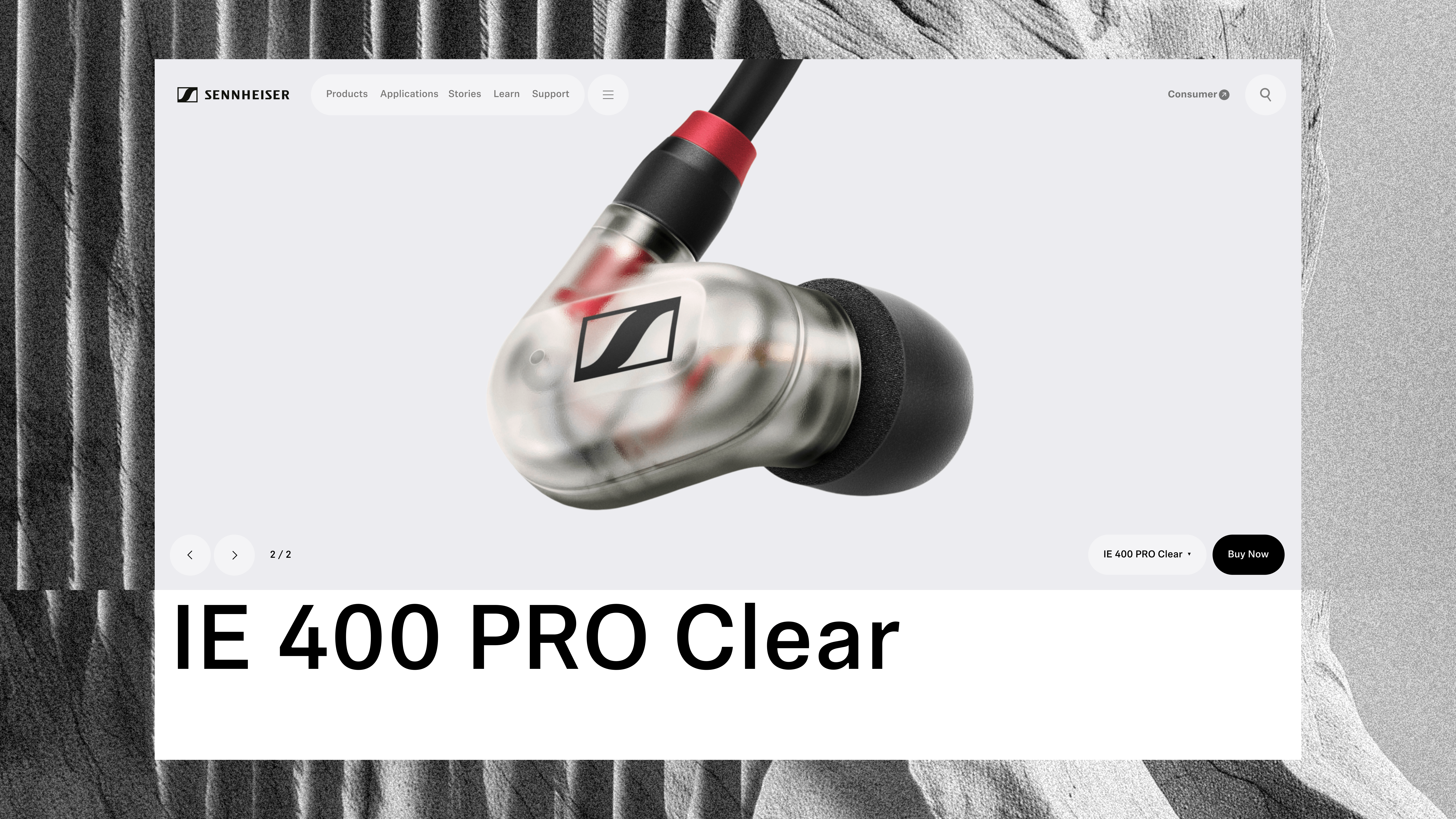
Helping to reposition Sennheiser for the professional audio market with a new web experience that focussed on the specific needs and habits of a very particular type of user.
Brand & Digital Creative Director
Helping to reposition Sennheiser for the professional audio market with a new web experience that focussed on the specific needs and habits of a very particular type of user.
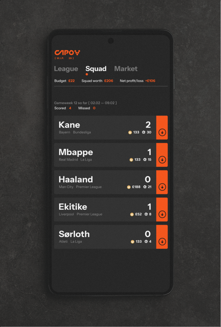
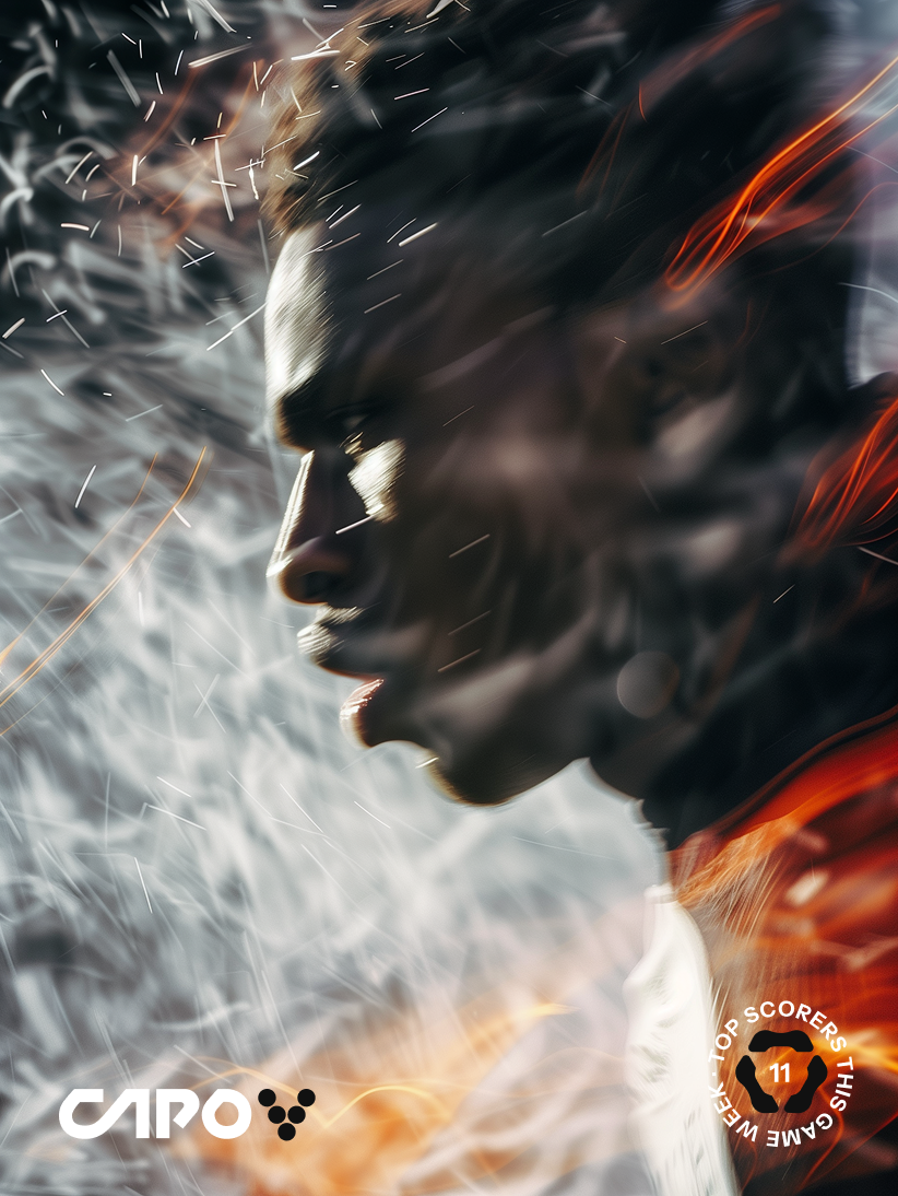
Reimagining fantasy football with an app experience that focuses on celebrating and trading goalscorers from across Europe's top 5 leagues. Vibe coded and launched in Beta as a side project.
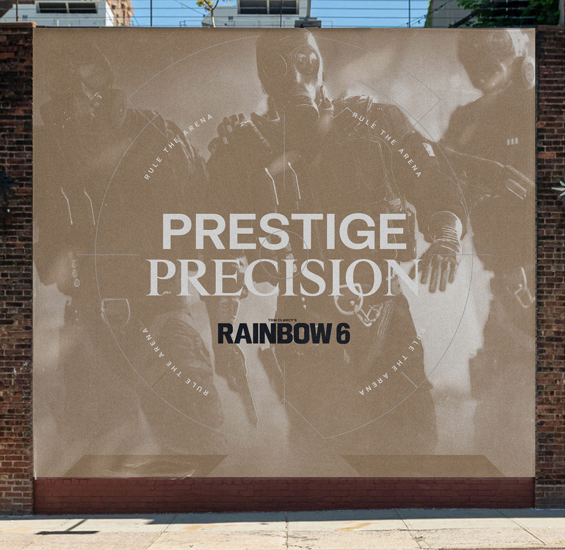
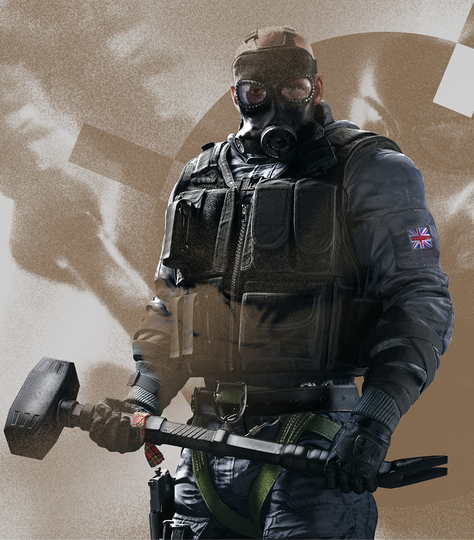
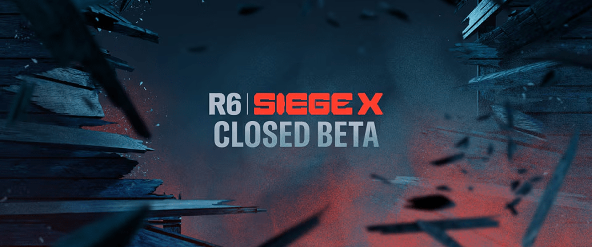
Revitalising Ubisoft's longest running game franchise with a new logo and identity system built around the specific styles of gameplay in the Rainbow 6 world.

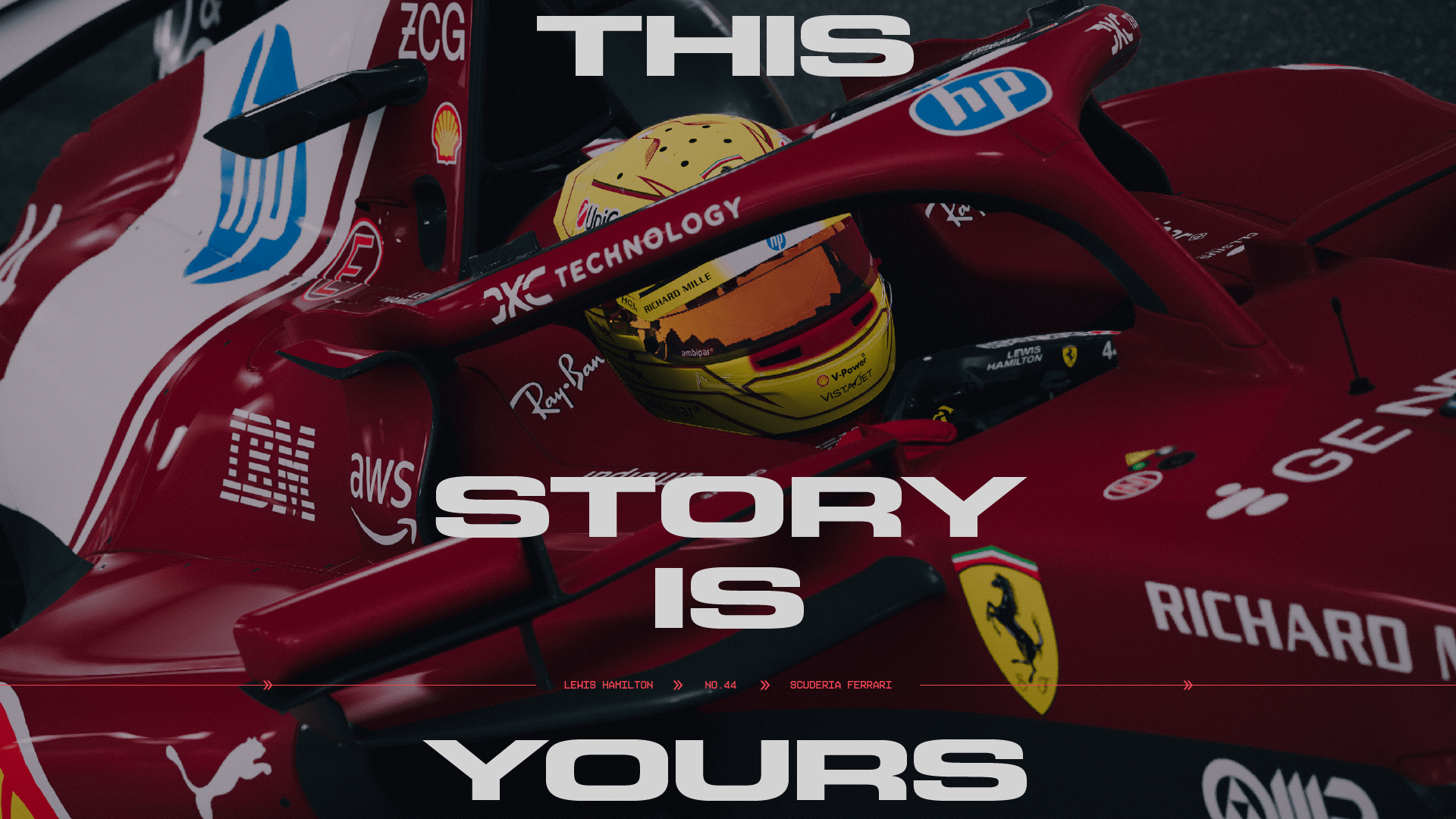
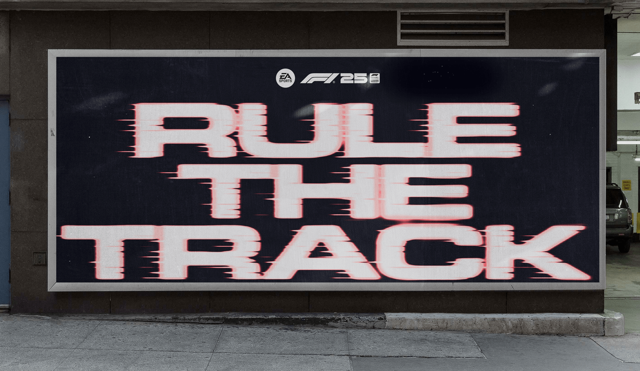
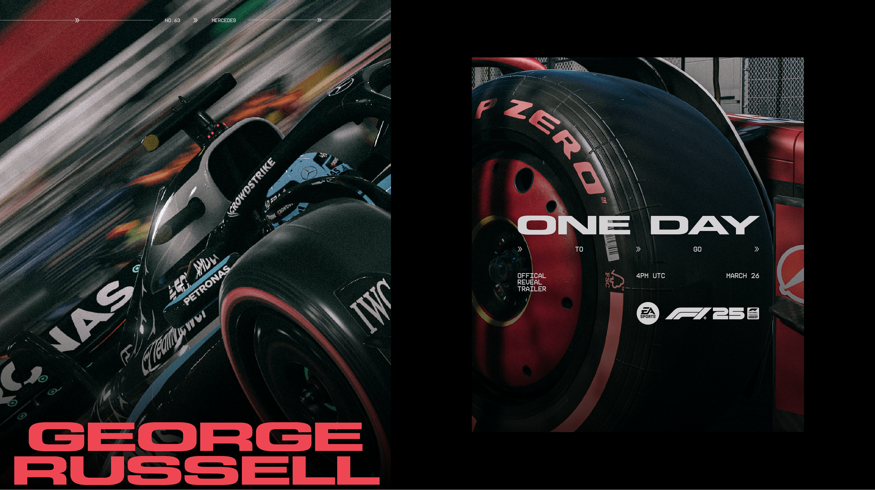
EA Sports wanted to capitalise on F1's surge in popularity for their most story driven release to date. We explored an exciting in-game and marketing toolkit that brings the thrill of speed from the driver's perspective into every touchpoint.
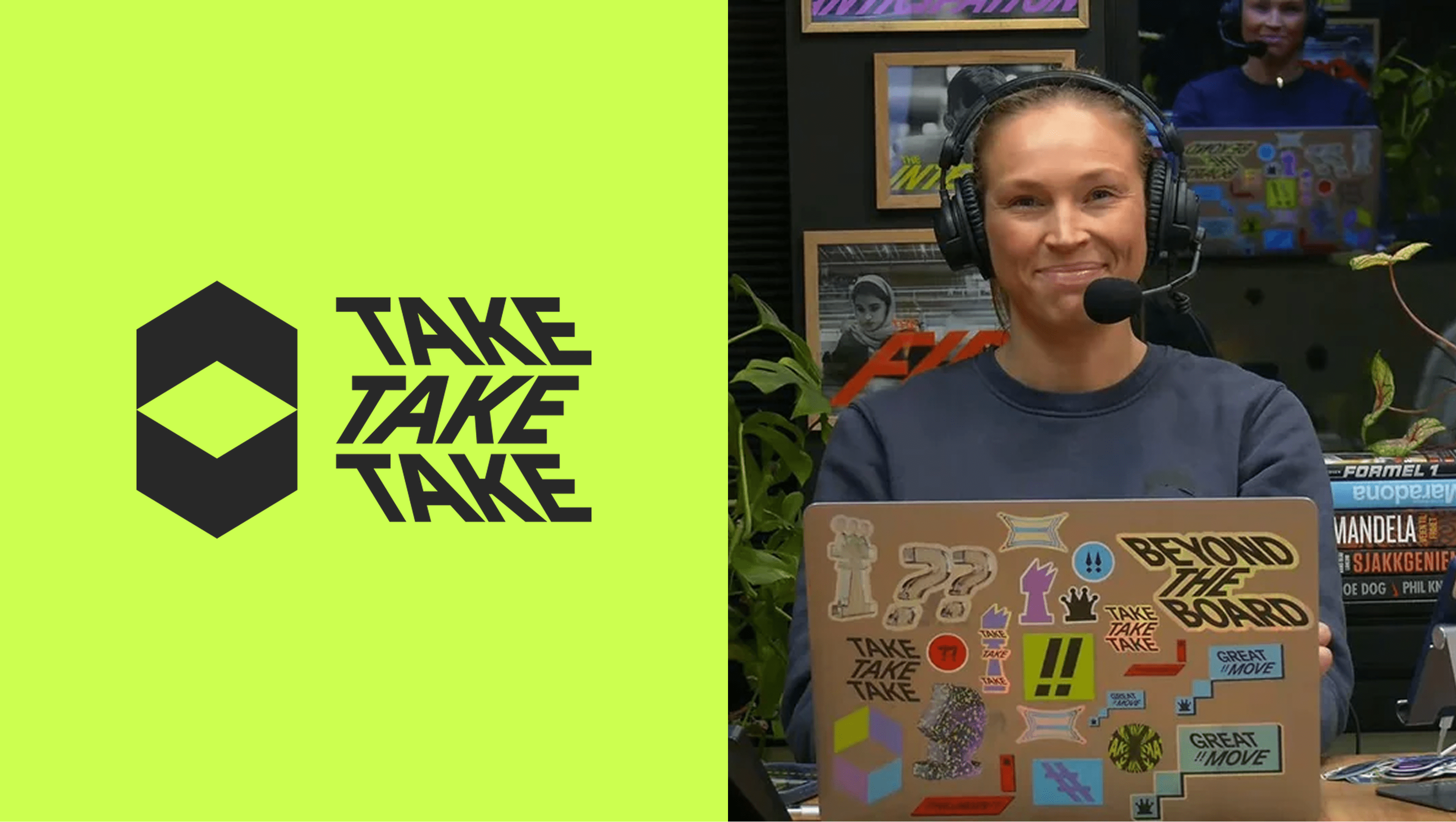
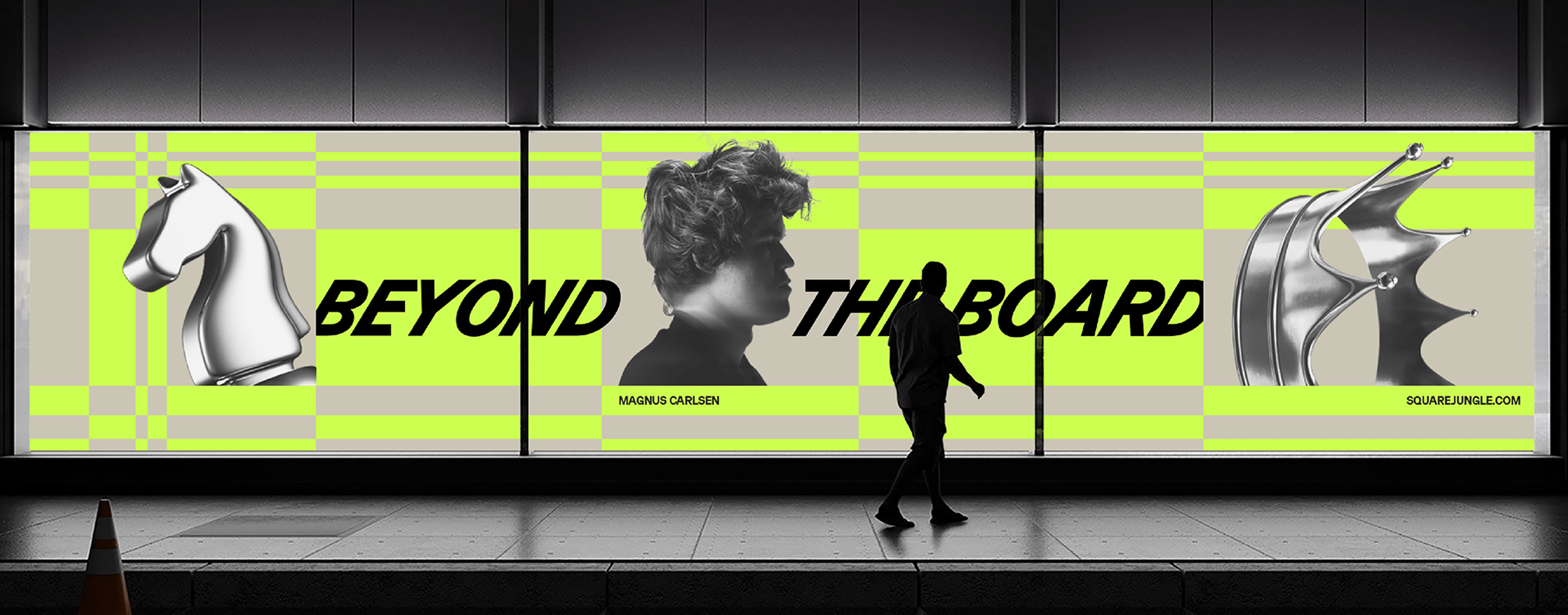
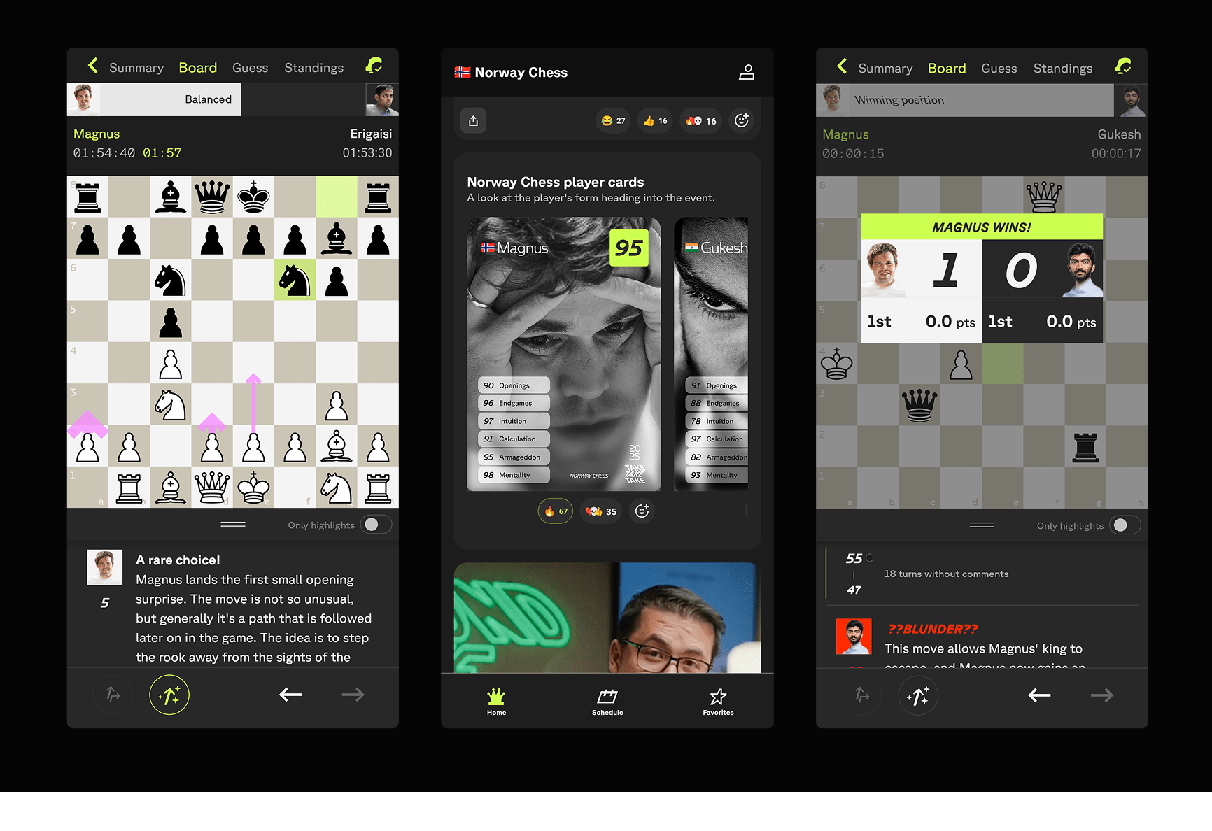
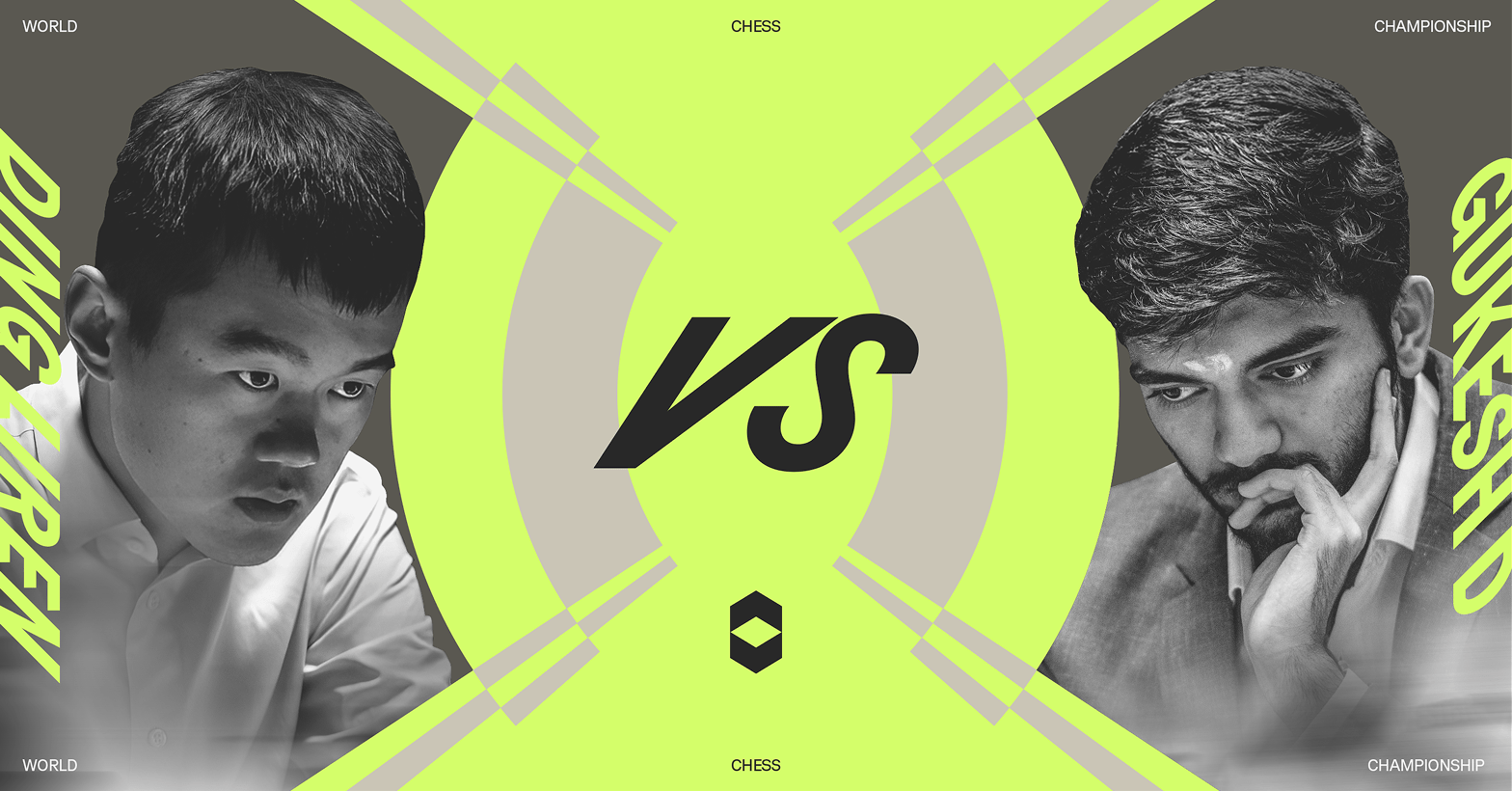
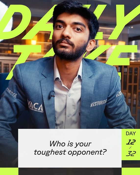
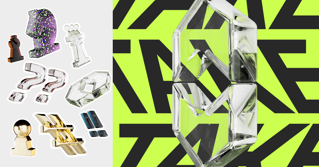
Helping launch Magnus Carlsen's new Chess app that takes the game 'Beyond The Board' with an exciting identity for product and broadcast.
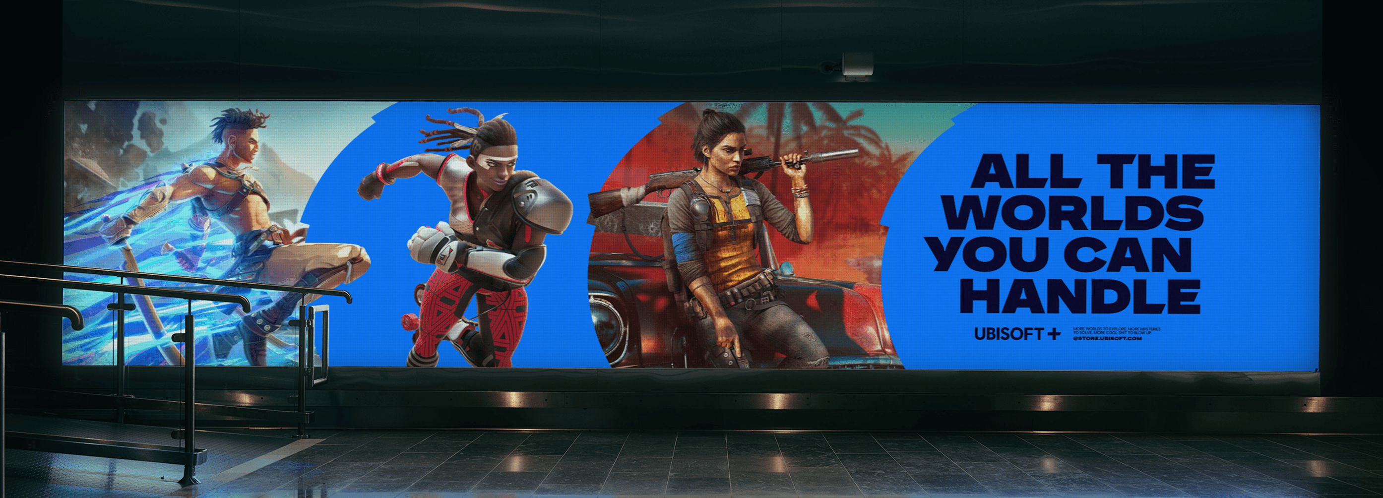
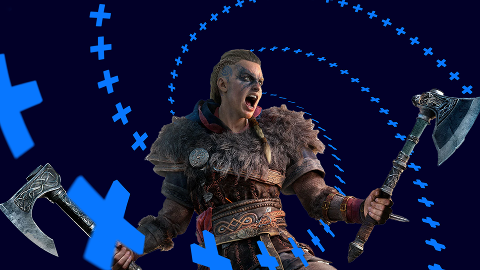
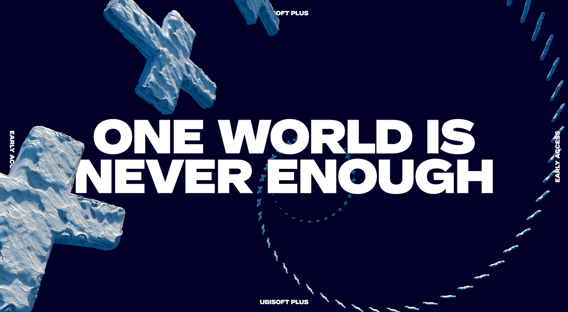
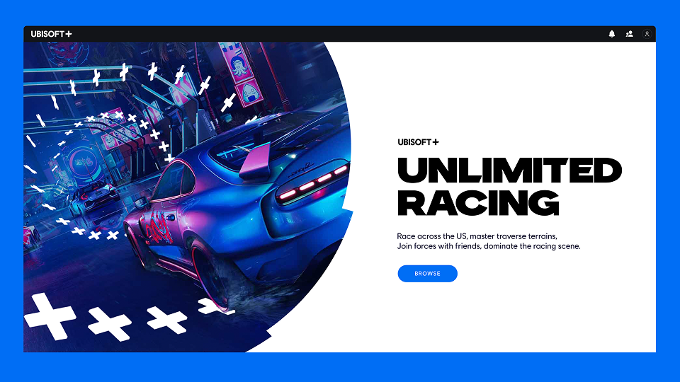
Partnering with the Ubisoft team to define their brand strategy, and show players that with Plus 'One World is Never Enough' with a new toolkit, typeface, 3D asset generator tool, and a new sonic identity.
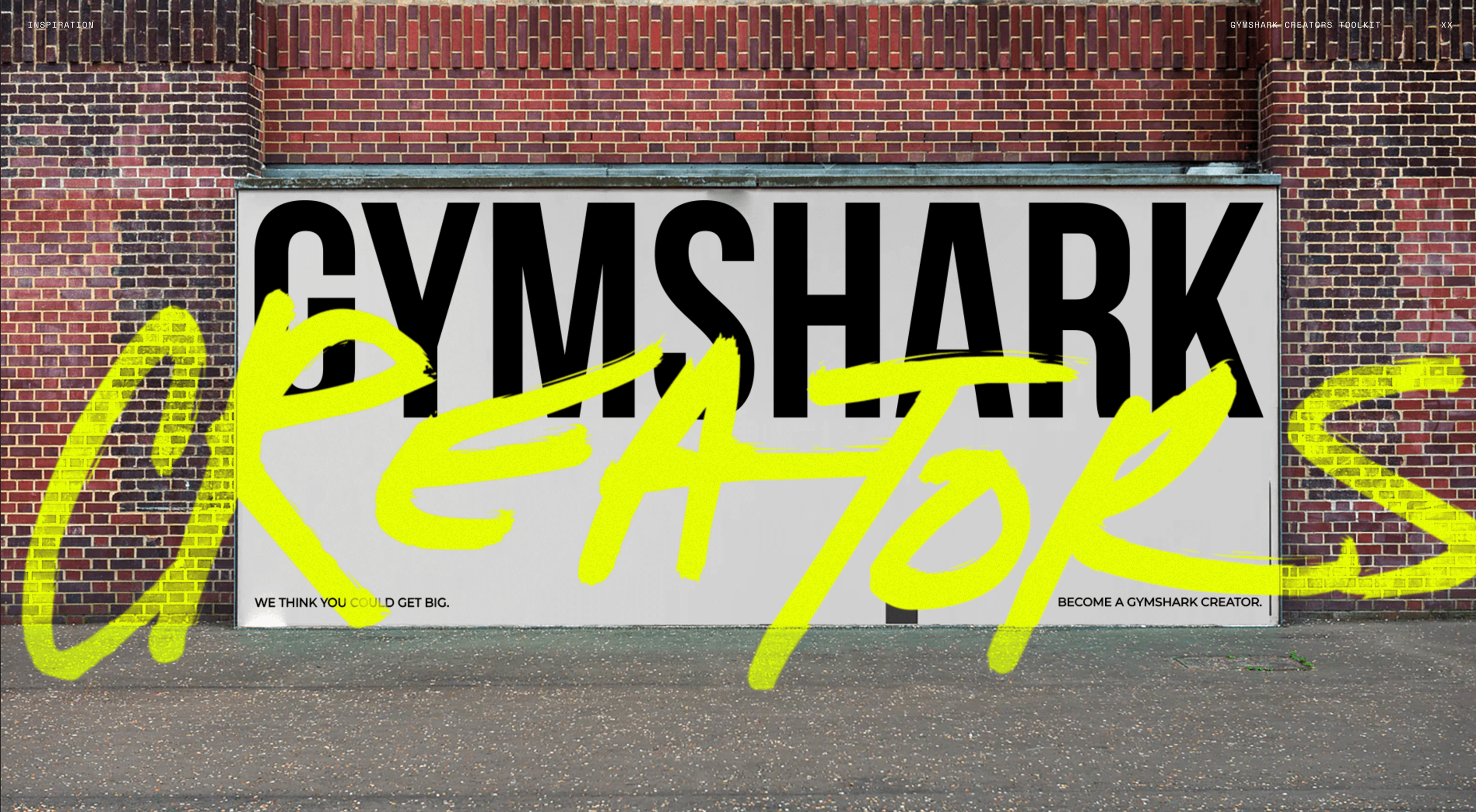
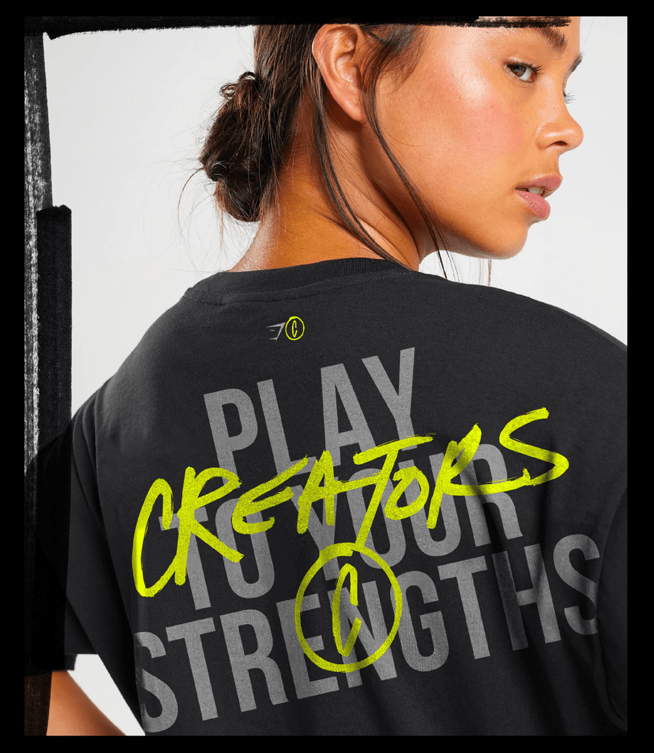
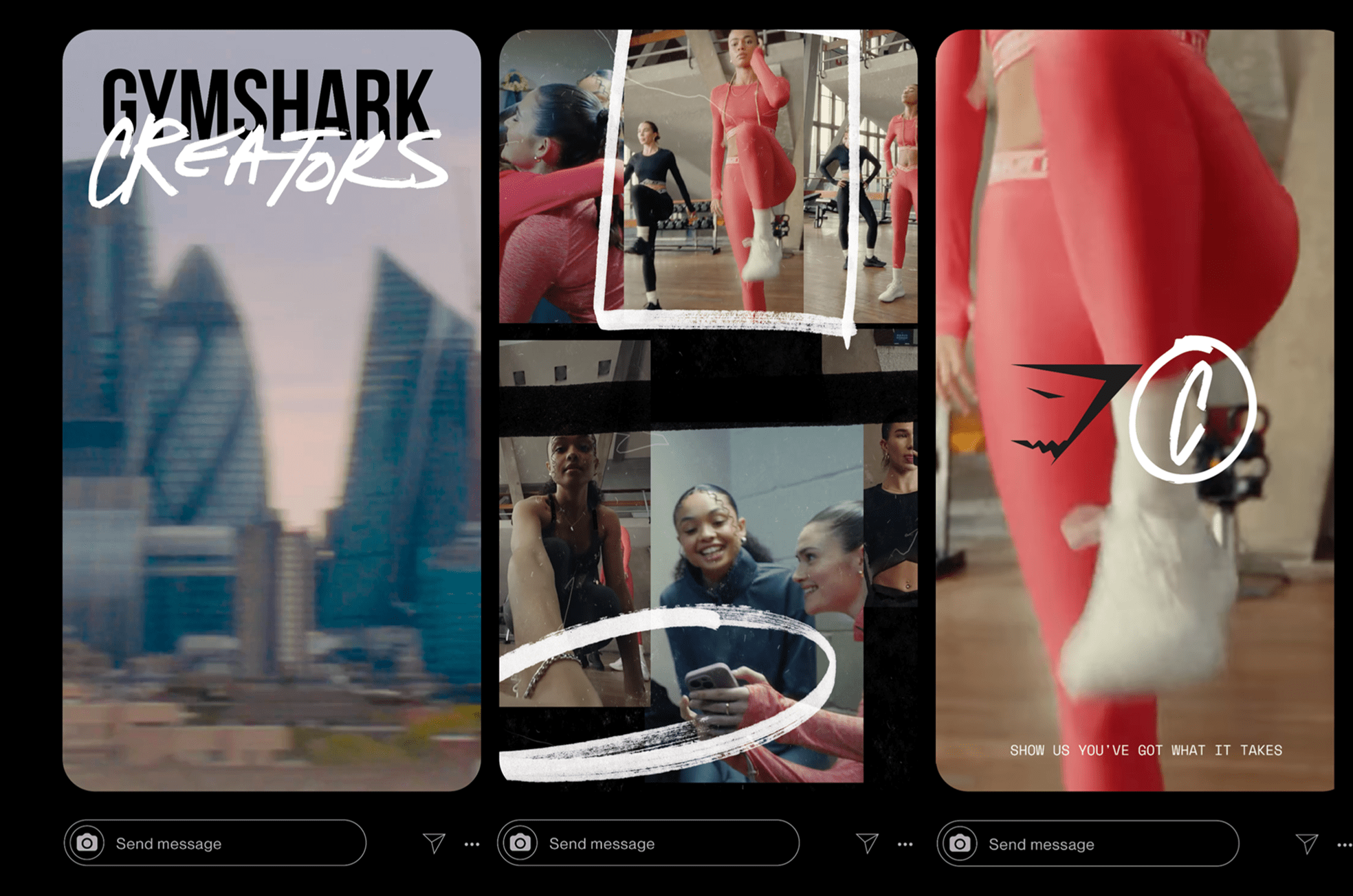
Building a new tier to Gymshark's influencer program, encouraging content creators of all shapes and sizes to collaborate with the brand and in their own way, and to play to their strengths.
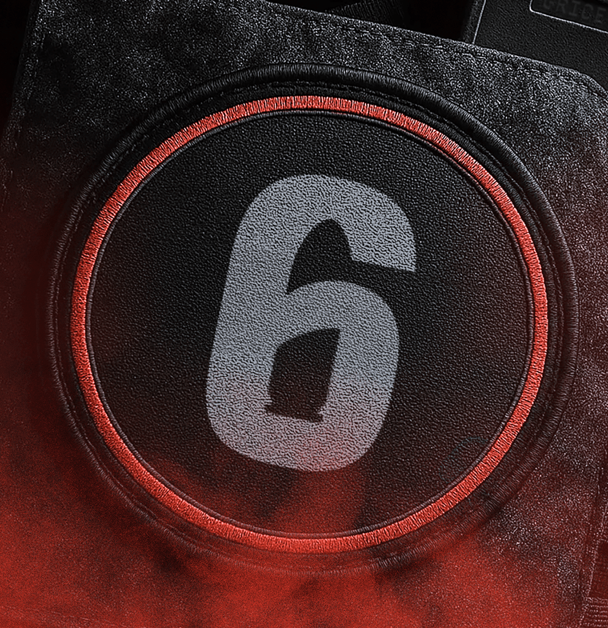
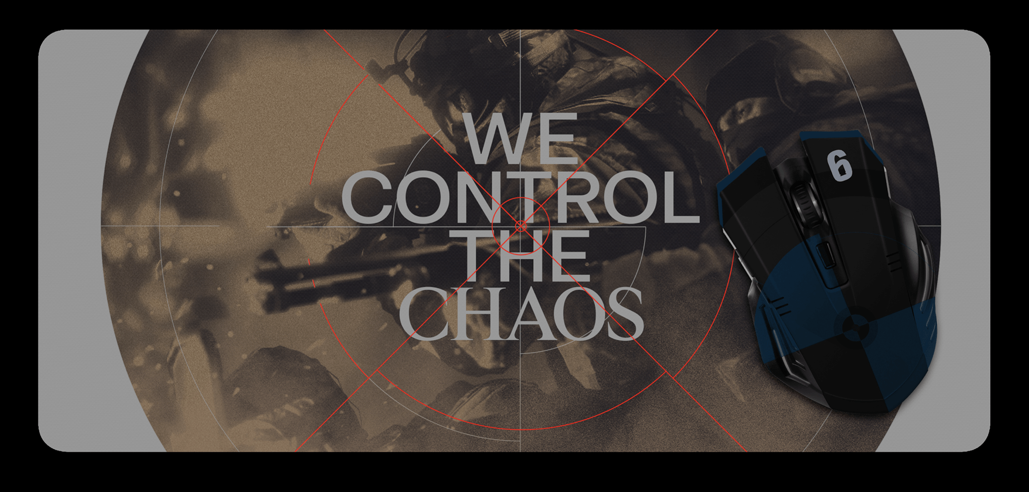
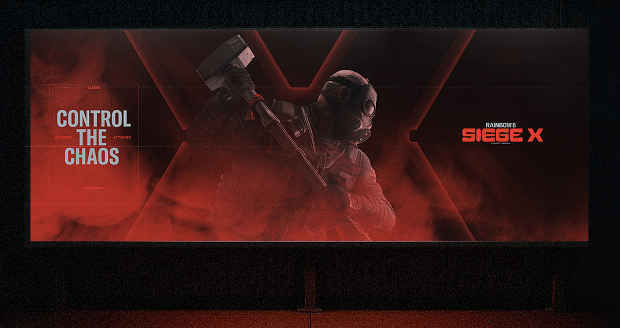
Refreshing Ubisoft's biggest FPS on it's 10th anniversary with an explosive new look that celebrates the game's controlled chaos.
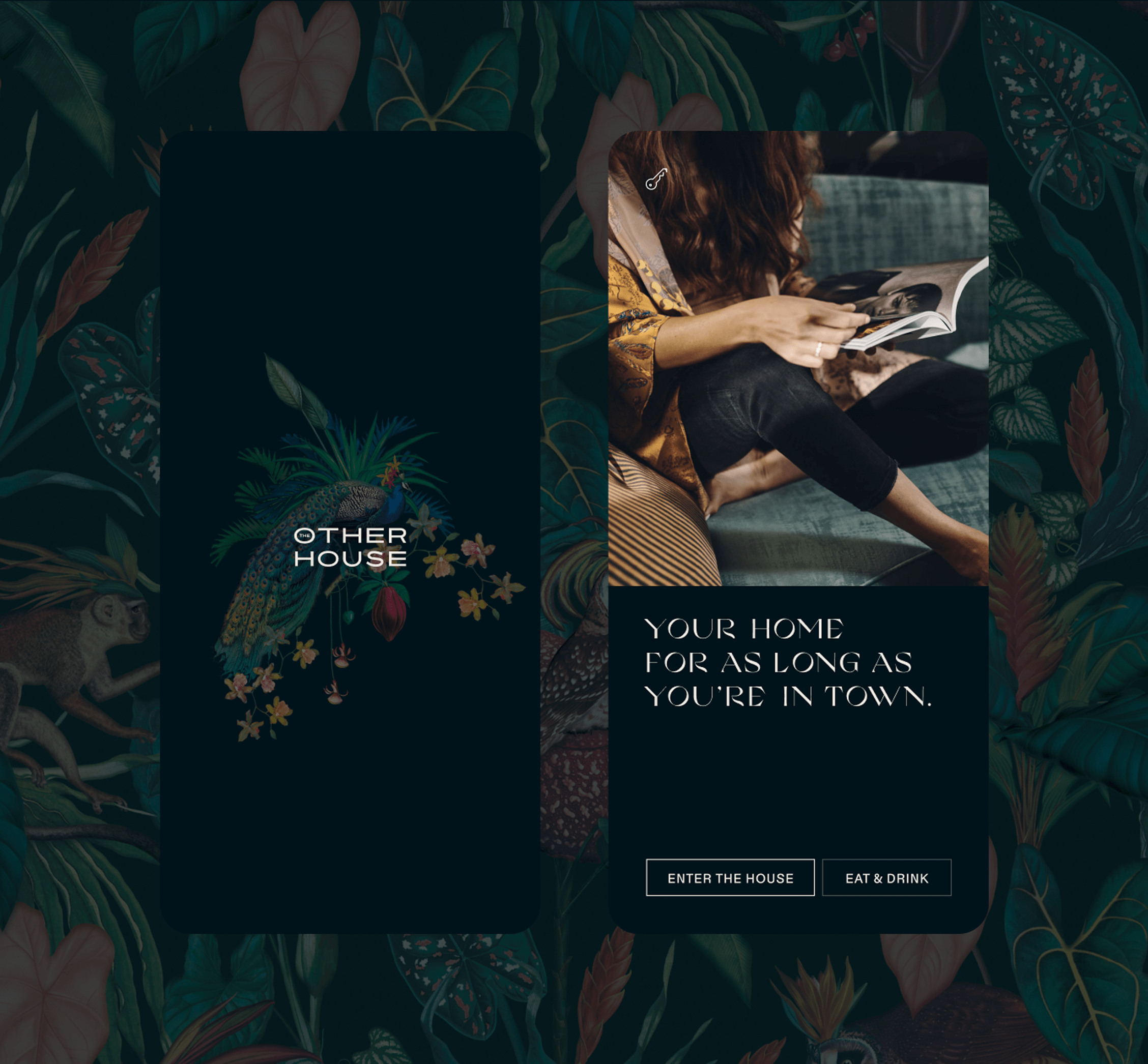
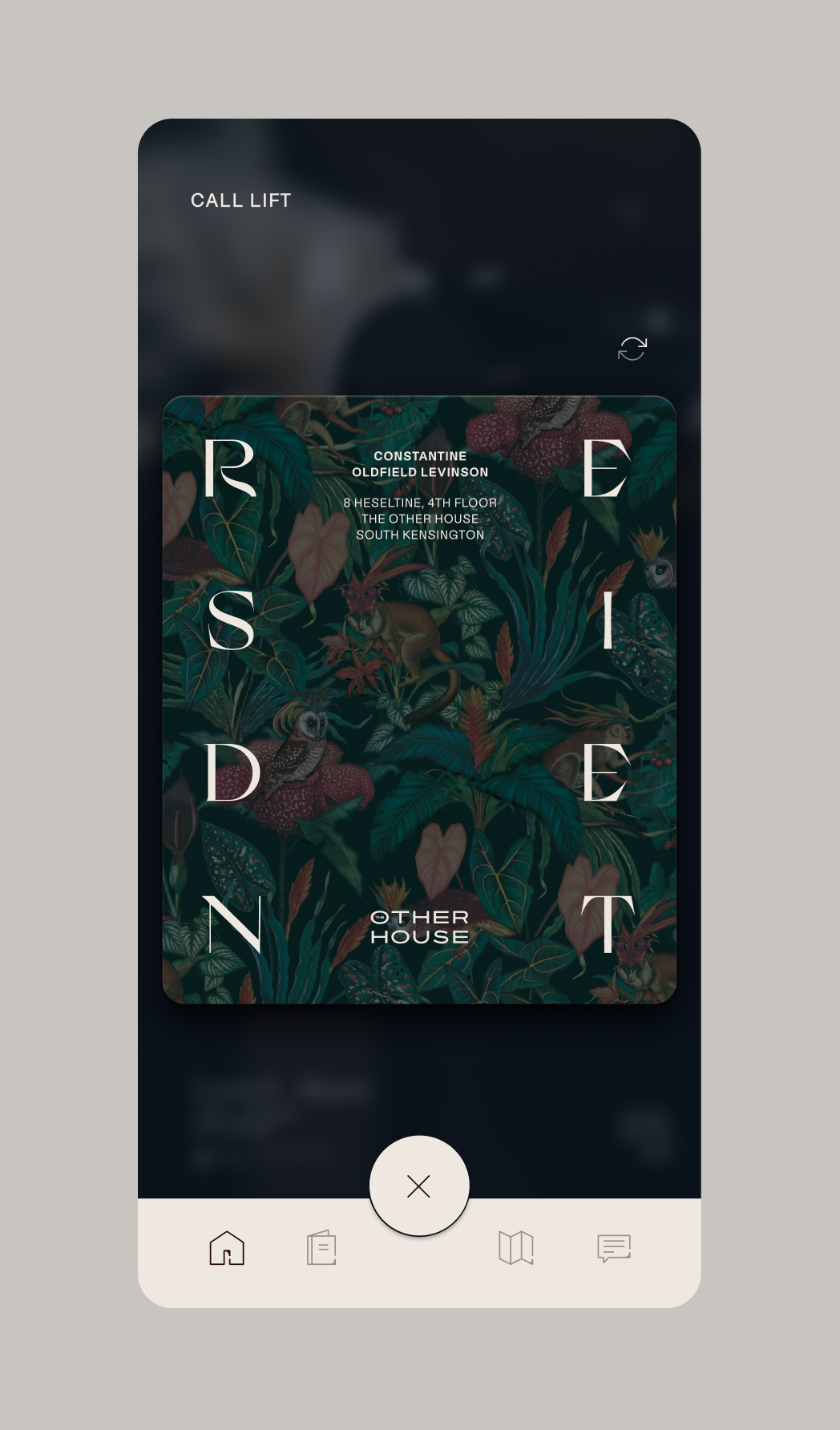
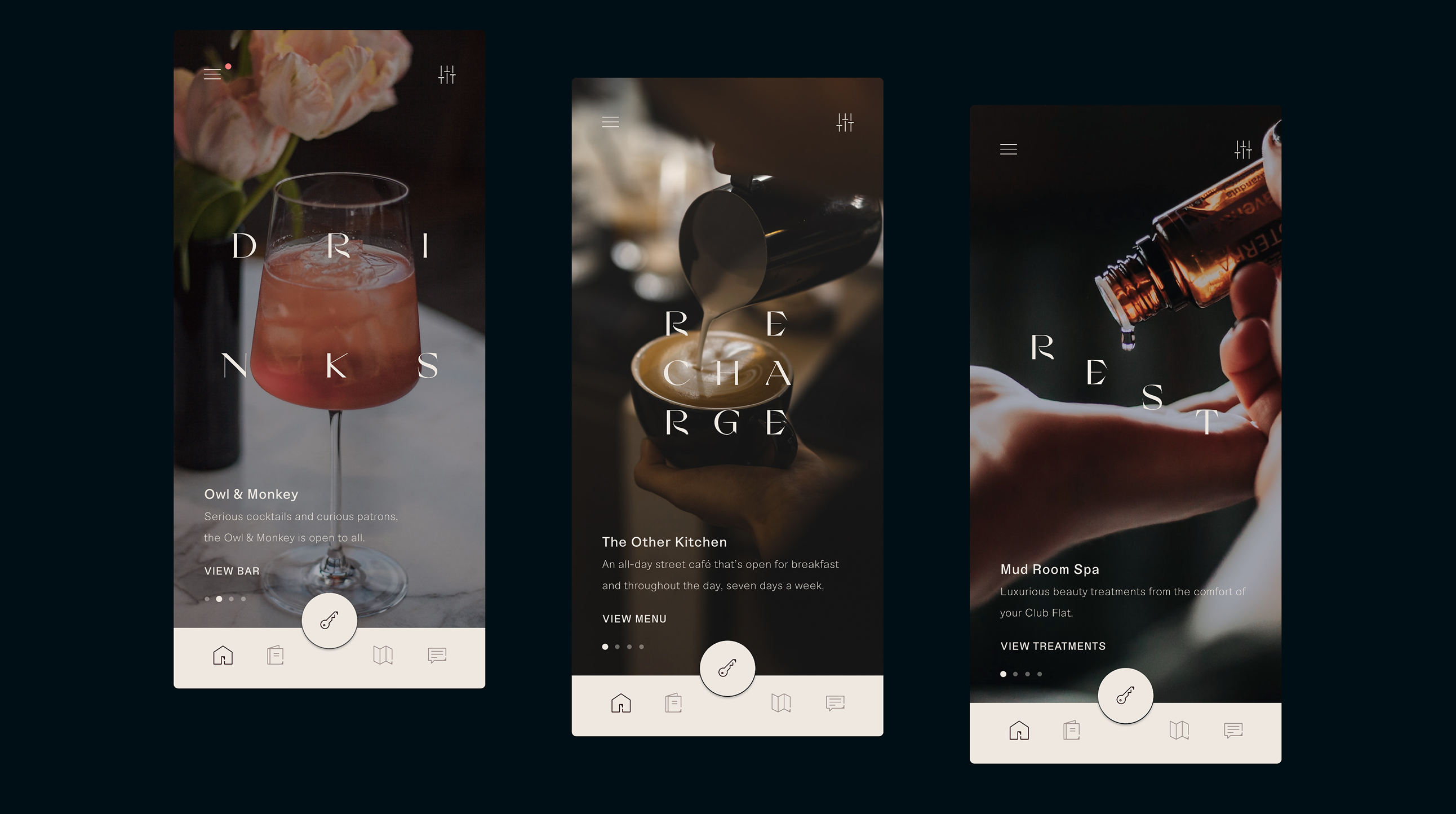
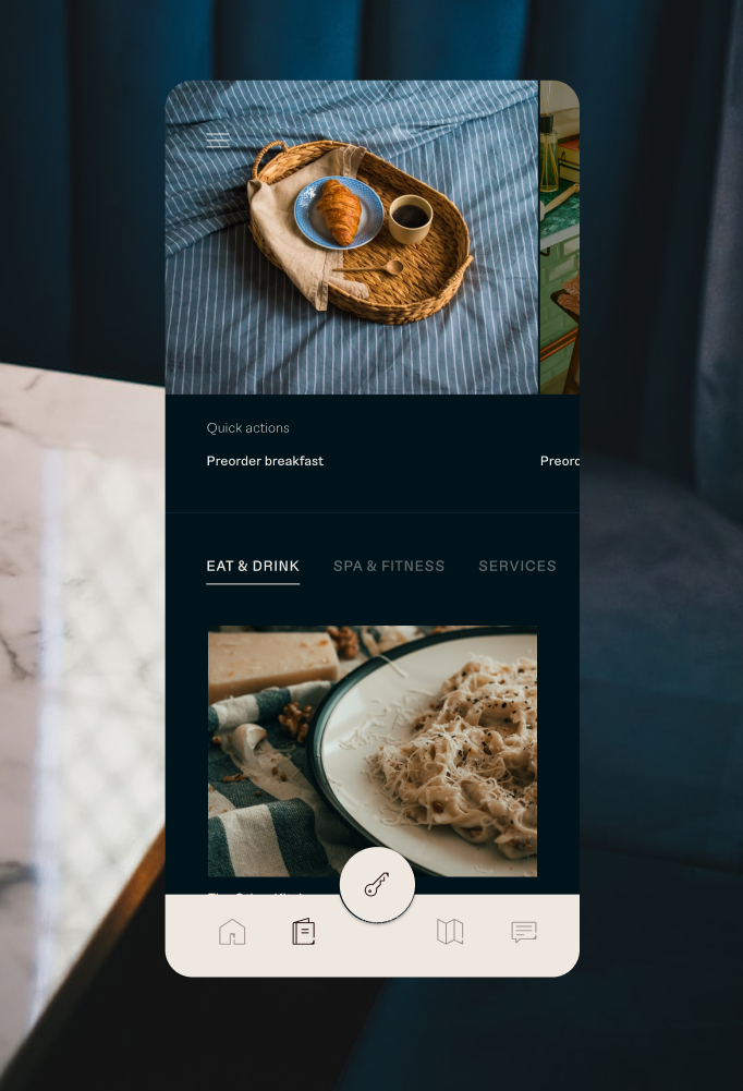
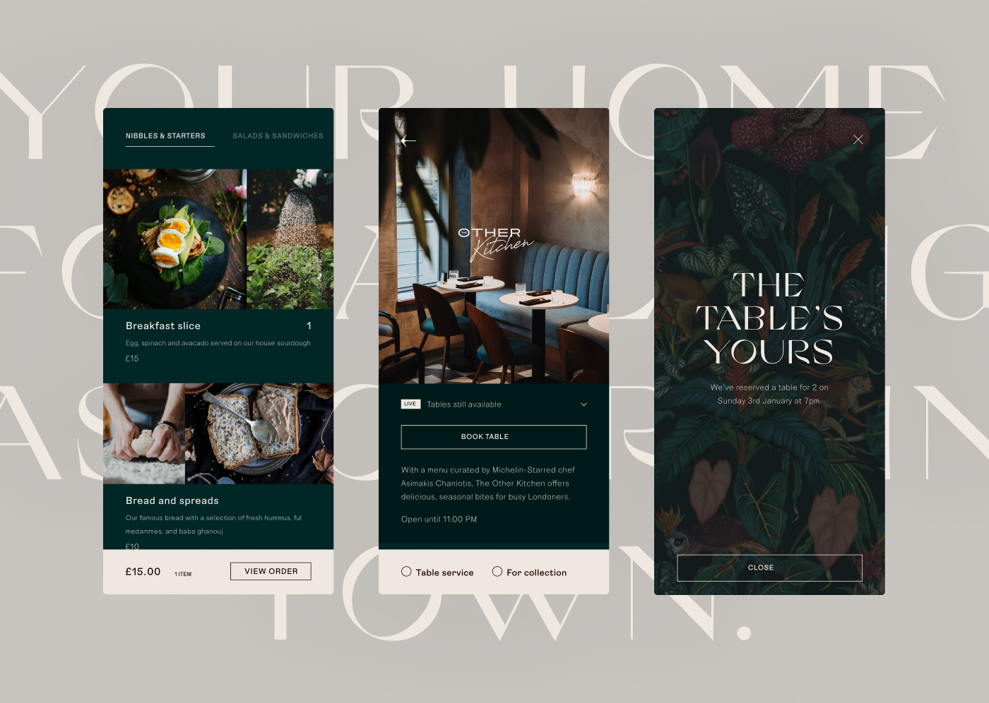
For new hotel brand, The Other House, an app was central for controlling every aspect of your stay. We extended the brand into the full experience, building a product that was as easy to use as it was full of charm.
Winner of Webby's 'Best Aesthetic Design' award.